Build a Responsive Card Slider with Swiper.js (Step-by-Step Guide)
By  ZaraDaly |
September 11, 2025
| Category: 🖥️ Web Development
ZaraDaly |
September 11, 2025
| Category: 🖥️ Web Development
ZaraDaly |
September 11, 2025
| Category: 🖥️ Web Development
JavaScript
HTML
CSS
Tutorial
Build a Responsive Card Slider with Swiper.js (Step-by-Step Guide)
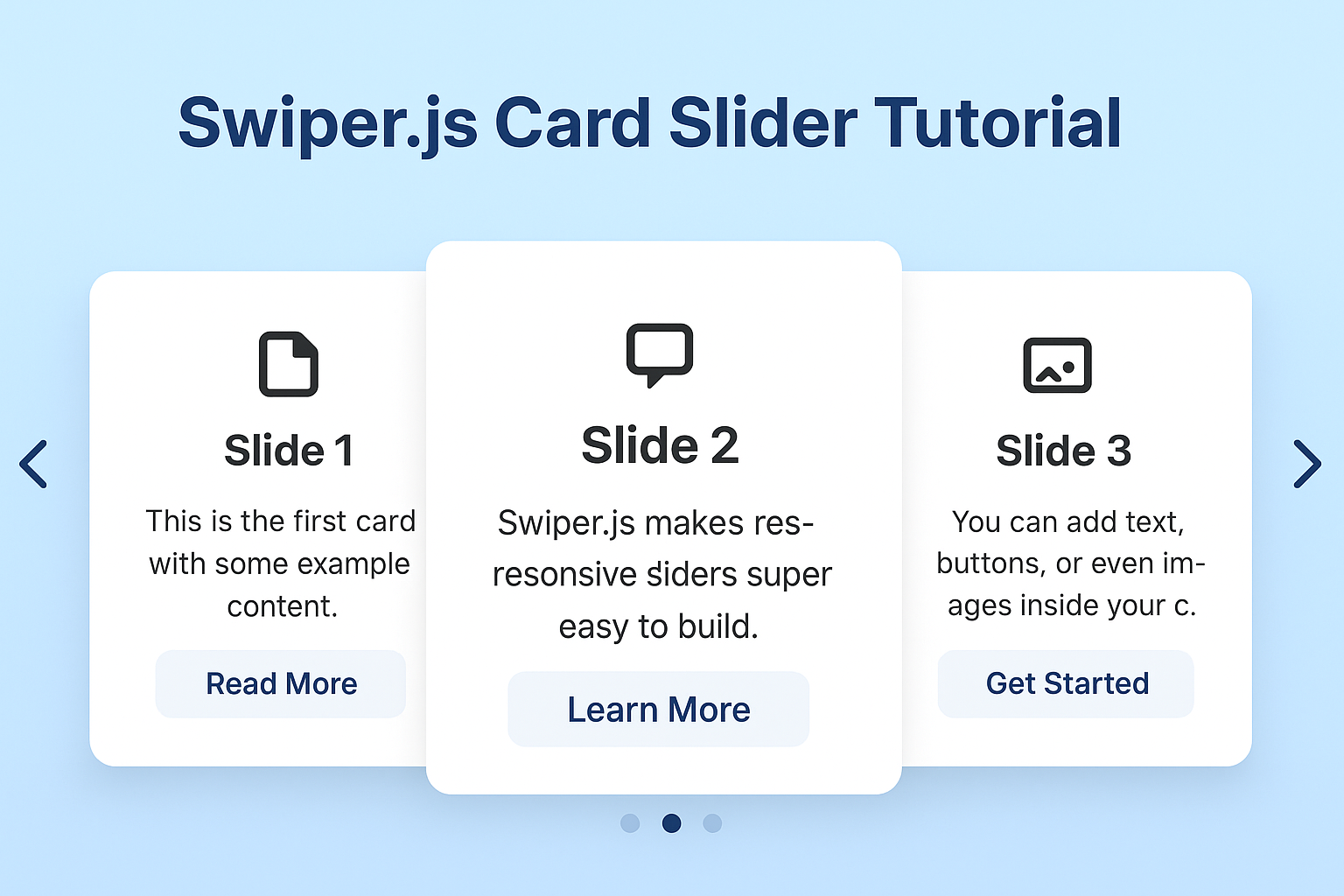
Sliders are a must-have in modern web design — whether you’re showcasing products, testimonials, or portfolio items. With Swiper.js, you can build a responsive, touch-friendly card slider in just a few lines of code.
In this tutorial, we’ll build a clean card swiper that adapts to mobile, tablet, and desktop screens.
🔧 Step 1: Add Swiper.js to Your Project
Include the Swiper CSS and JS from a CDN:
<link rel="stylesheet" href="https://cdn.jsdelivr.net/npm/swiper@11/swiper-bundle.min.css" />
<script src="https://cdn.jsdelivr.net/npm/swiper@11/swiper-bundle.min.js"></script>
🎴 Step 2: Create the HTML Structure
Here’s the basic markup for our slider:
<div class="swiper mySwiper">
    <div class="swiper-wrapper">
        <div class="swiper-slide">Slide 1</div>
        <div class="swiper-slide">Slide 2</div>
        <div class="swiper-slide">Slide 3</div>
        <div class="swiper-slide">Slide 4</div>
        <div class="swiper-slide">Slide 5</div>
        <div class="swiper-slide">Slide 6</div>
        <div class="swiper-slide">Slide 7</div>
        <div class="swiper-slide">Slide 8</div>
        <div class="swiper-slide">Slide 9</div>
    </div>
</div>
🎨 Step 3: Style the Cards with CSS
Let’s make the cards look nice with a little CSS:
.swiper {
    width: 240px;
    height: 320px;
}

.swiper-slide {
    display: flex;
    align-items: center;
    justify-content: center;
    border-radius: 18px;
    font-size: 22px;
    font-weight: bold;
    color: #fff;
}

.swiper-slide:nth-child(1n) {
    background-color: rgb(206, 17, 17);
}

.swiper-slide:nth-child(2n) {
    background-color: rgb(0, 140, 255);
}

.swiper-slide:nth-child(3n) {
    background-color: rgb(10, 184, 111);
}

.swiper-slide:nth-child(4n) {
    background-color: rgb(211, 122, 7);
}

.swiper-slide:nth-child(5n) {
    background-color: rgb(118, 163, 12);
}

.swiper-slide:nth-child(6n) {
    background-color: rgb(180, 10, 47);
}

.swiper-slide:nth-child(7n) {
    background-color: rgb(35, 99, 19);
}

.swiper-slide:nth-child(8n) {
    background-color: rgb(0, 68, 255);
}

.swiper-slide:nth-child(9n) {
    background-color: rgb(218, 12, 218);
}

.swiper-slide:nth-child(10n) {
    background-color: rgb(54, 94, 77);
}
⚡ Step 4: Initialize Swiper
Now we’ll activate the slider with JavaScript:
var swiper = new Swiper(".mySwiper", {
    effect: "cards",
    grabCursor: true,
    breakpoints: {
        768: {
            slidesPerView: 2,
        },
        1024: {
            slidesPerView: 3,
        },
    },
});
✅ Why Use Swiper.js?
- Touch support out of the box.
- Responsive with breakpoints.
- Lightweight and fast.
- Works great with frameworks like Laravel, Vue, React, and plain HTML.
📌 Conclusion
That’s it! You now have a fully working responsive card slider using Swiper.js. You can customize it further by adding autoplay, dynamic slides, or advanced animations.
🚀 Live Result
React:
Comments (0)
No comments yet.